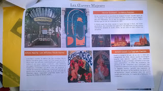
There were not a lot of bad surprises this year, I would say they did a lot of good work, losing a little in the synthesis and some layout failures despite my (wise!) advices like a text block with a background colour out of nowhere regarding the booklet, or like images arranged to fill the blank ont eh last page when all the other pages were well balanced:
Then some people hope that they can have a better grade by flattering me:
"I thank you to put this name in the proposal mister teacher of design." I wasn't excpeting this!
Each time I say my students I prefer images than too much text. Buuuut, and as I wrote this year was a good one, some are able to give you the envy to read all the text just by the quality of their presentation:
Each time I say my students I prefer images than too much text. Buuuut, and as I wrote this year was a good one, some are able to give you the envy to read all the text just by the quality of their presentation:


No comments:
Post a Comment